
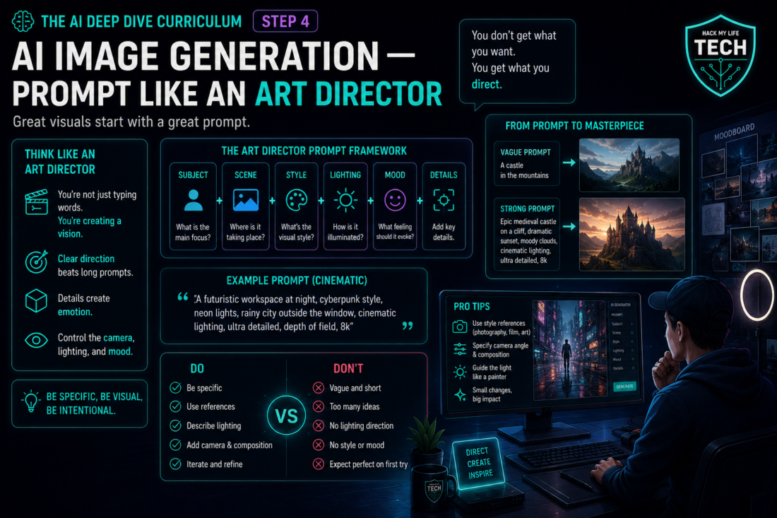
Welcome to the Creation Studio — Phase 2 of the AI Deep Dive. For three lessons you’ve bent text to your will: engineering context, grounding in your files, building assistants. Today we leave words behind and pick up a paintbrush. You’re about to turn the picture in your head into pixels on demand — no design degree, no Photoshop, no stock-photo budget.
Here’s the reframe that runs the whole lesson:
💡 You are not “typing a picture.” You are directing one. A vague request gets a generic image; a real brief — subject, style, composition, lighting, medium — can move the result closer to your intended direction. AI image generation isn’t a slot machine you pull. It’s an image-generation system that you can guide through clear visual direction.
By the end you’ll understand just enough about how these models work to prompt them well, own the five-part image-prompt formula, know how to iterate and keep a consistent style across generations, and — the part most tutorials skip — understand the commercial-rights and copyright basics that keep your visuals safe to actually use.
1. A Different Species: Why Image Models Aren’t Chatbots
Everything you learned in Essentials was about LLMs — next-token predictors. Image models are a different species, and knowing the one core idea makes you prompt dramatically better.
Many mainstream image generators use diffusion or related methods, but architectures vary by product. Here’s the whole intuition, no math: For the original diffusion formulation, see the research paper Denoising Diffusion Probabilistic Models. For latent-diffusion approaches used in high-resolution image synthesis, see High-Resolution Image Synthesis with Latent Diffusion Models.
Sources:
- Denoising Diffusion Probabilistic Models
- High-Resolution Image Synthesis with Latent Diffusion Models
💡 The Sculptor in the Static: Imagine a screen of pure TV static — random noise. Many image systems are trained on large collections of images and associated text, although the exact data and training methods vary by provider. To do one thing astonishingly well: take that noise and, step by step, remove the parts that don’t match your description, as if chiseling a statue out of visual fog. “A red apple on a wooden table” tells the sculptor which noise to keep and which to carve away. The image doesn’t get drawn; it gets revealed from the static.
Two practical truths fall out of this immediately:
- Every generation is unique. The generation process usually starts from a new or varied noise state, so the same prompt yields different images — a feature for exploring, a challenge for consistency (we’ll solve that in Section 4).
- The model matches your words to patterns it learned from captions. So the richness and precision of your description directly controls the result. Vague words carve a vague statue. This is why art direction beats wishful typing.
2. The Image-Prompt Formula: S-S-C-L-M
The R-C-T-F-E briefing formula from Essentials Step 6 built great text prompts. Visuals have their own five-part brief. Memory hook: “Some Streets Change Little Miracles.”
- S — Subject: What is in the frame? Be concrete. Not “a dog,” but “a golden retriever puppy with one ear flopped, sitting in tall grass.”
- S — Style: What visual language? The single highest-impact word. “Photorealistic,” “watercolor,” “3D render,” “flat vector illustration,” “film noir,” “1970s film photograph.” Style decides everything.
- C — Composition: How is it framed? “Close-up,” “wide establishing shot,” “top-down flat lay,” “rule of thirds,” “centered symmetrical.” This is where you direct the camera.
- L — Lighting: What light and mood? The secret weapon amateurs skip. “Soft morning light,” “dramatic rim lighting,” “neon glow,” “golden hour,” “moody low-key.” Lighting is 50% of the feeling.
- M — Medium/Detail: Finishing specs. “Shot on 35mm,” “octane render,” “highly detailed,” aspect ratio, color palette. The final polish.
Beige prompt: “a coffee cup.” Art-directed prompt: “Overhead flat-lay of a steaming ceramic coffee cup on a rustic oak table (Subject + Composition), warm minimalist lifestyle-blog style (Style), soft natural window light from the left casting a gentle shadow (Lighting), shot on 50mm, highly detailed, muted earth tones (Medium).”
Same tool. One gives you clip-art; the other gives you a usable blog header. You didn’t get luckier — you directed.
3. Iterate Like a Director, Not a Gambler
Your first image is a first draft, not a verdict. Weak users mash “regenerate” and pray (slot machine). Directors steer:
- Change one variable at a time. Swap only the lighting, or only the style, so you learn what each word does. Change five things and you’ve learned nothing.
- Add, then subtract. If a detail is missing, name it explicitly. If something unwanted appears, Some tools support negative prompts, while others use different controls to reduce unwanted details — “no text, no extra fingers, no clutter.”
- Reuse an available seed for controlled testing. Where a tool exposes a seed, reusing it with the same model and settings can help create more controlled variations, but it does not guarantee identical results (the specific starting noise). Reuse the seed to make small tweaks to the same base image instead of rolling a brand-new one — the key to controlled iteration.
4. The Consistency Problem (and How Pros Solve It)
Because every generation carves fresh noise, getting the same character or a coherent brand look across many images is the single hardest skill — and the one that separates hobbyists from people running a real visual pipeline. Three levers, simplest first:
- Lock your style block. Keep the Style + Lighting + Medium portion of your prompt identical across every image; only change the Subject and Composition. This alone gives a recognizable house look.
- Use reference images. Some tools let you upload reference images to guide style, character or colour direction, but feature names and results vary by product and plan.
- Use the tool’s consistency features. Newer platforms offer character-reference or style-reference controls built for exactly this. Features and names shift fast, so check current official docs — but the concept (anchor the model to a reference) is durable.
5. The Part Tutorials Skip: Can You Actually Use This Image?
Generating a great image is easy. Knowing whether you’re legally safe to publish or sell it is the part that protects your side hustle — and it’s the direct continuation of the ethics thread from Essentials Step 7. Three things every creator must internalize:
- Terms of use ≠ copyright, and they vary by tool and plan. Each platform’s terms govern what you may do with outputs — and free vs. paid tiers often differ, with some free tiers restricting commercial use. Before you monetize anything, read the current terms of the specific tool and plan you used. This is non-negotiable homework, not legal paranoia.
- The copyright status of AI images is genuinely unsettled — and jurisdiction-dependent. Notably, the U.S. Copyright Office has taken the position that works lacking sufficient human authorship aren’t eligible for copyright protection, which affects whether you can claim copyright over a purely AI-generated image. The law here is actively evolving and differs by country, so treat “who owns this?” as an open, region-specific question, not a settled one.
- Source: U.S. Copyright Office — Copyright and Artificial Intelligence (official policy hub; consult for current guidance).
- Don’t generate infringing or protected content. Prompting for trademarked characters, copyrighted logos, or “in the style of [a specific living artist]” can create copyright, trademark, publicity, or ethical risks, and — recalling Essentials Step 7 — never generate images of real, identifiable people in false or defamatory situations. Build your own look instead of borrowing someone’s protected one.
None of this is a reason to avoid AI images. It’s the difference between a creator who builds a safe, sellable visual library and one who unknowingly publishes a liability. When in doubt on a real commercial project, the honest move is to check the tool’s terms and, for high-stakes use, consult a professional — this article is education, not legal advice.
🙋 6. Common Beginner Questions: Three Practical Scenarios
(Representative scenarios beginners commonly face when building a visual workflow — answered without jargon.)
Q1 — Scenario: a stay-at-home parent who blogs and sells printables: “I have zero design skills and I’m nervous about the legal stuff. These steps can reduce avoidable risk, but they do not guarantee that every output is legally cleared for every product, market or jurisdiction.”
Answer: A clear brief can help you create usable images, but commercial use and copyright questions still require checking the tool’s terms and your local rules.
On quality: design skill is exactly what the S-S-C-L-M formula replaces — you’re not drawing, you’re describing, and one clear style direction plus thoughtful lighting can help beginners create more consistent visual results. Start by locking one style block (Section 4) so all your printables share a recognizable look, which is what makes a shop feel professional.
On safety, three rules keep you clean:
- first, use a tool whose current terms permit commercial use on your plan (read them once, before you sell — some free tiers don’t allow it);
- second, build your own style instead of prompting “in the style of [famous artist]” or trademarked characters; third, since the copyright status of AI images is unsettled.
- And region-dependent, don’t assume you exclusively “own” a raw generation the way you’d own a hand-drawn one — check the Copyright Office guidance linked above if that matters to your product.
- Do those three, and these steps can reduce avoidable risk while others wing it.
Q2 — Scenario: a solo founder who needs a consistent brand look: “One-off images are easy, but everything I make looks like it came from five different companies. How do I get a cohesive brand identity without hiring a designer?”
Answer: This is the pro problem, and the fix is disciplined consistency, not more talent. Build a reusable brand style block — a fixed Style + Lighting + Medium string you paste into every single generation (e.g., “flat vector illustration, soft pastel palette, minimal, soft even lighting, generous negative space”), and only vary the Subject and Composition per image. That one habit, from Section 4, is what makes ten different graphics read as one brand.
Level it up with reference images: generate one “hero” image you like, then use it as a style reference where the tool supports that feature; results can still vary across models, settings and plans.
And here’s the compounding move that ties Phase 1 to Phase 2: save your winning brand style block into the prompt library you started in Deep Dive Step 1, or bake it into a custom assistant from Step 3 so it’s applied automatically. Consistency stops being willpower and becomes a saved system.
Q3 — Scenario: an AI-major student who wants the real mechanism: “You said diffusion ‘removes noise.’ But how does it know which noise corresponds to ‘apple’? Where does the text actually connect to the pixels?”
Answer: Sharp question — the bridge is the piece the sculptor analogy glosses over.
Two systems work together.
- First, many systems use a text-and-image representation that helps connect phrases such as “a red apple” with visual patterns, although the training data and architecture vary by provider (This is conceptually related to embeddings, but it is not the same retrieval implementation used by RAG).
- Second, the diffusion model is trained by taking real images, progressively adding noise until they’re static, and learning to reverse that process; at generation time it starts from pure noise and denoises step by step, and at each step your caption’s embedding “pulls” the denoising toward regions of that meaning space matching your words.
- So “apple” doesn’t map to specific pixels — it biases every denoising step toward the visual patterns statistically associated with apple-captioned images in training.
- That’s also why models fumble rare or precisely-specified things (exact text in images, six-fingered hands): if a pattern was rare or inconsistent in training captions, the denoising has weak guidance.
- Knowing this tells you when to trust it (common, well-described scenes) and when to verify or fix by hand (precise text, anatomy, brand-exact details) — the same calibration habit Essentials Step 7 gave you, now applied to pixels.
7. Cheat Sheet
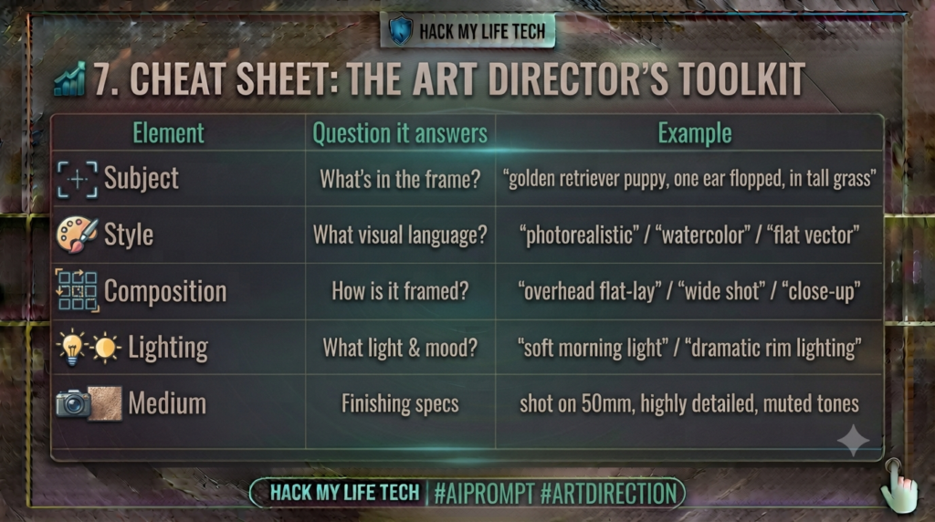
The consistency levers: lock your style block · use reference images · use the tool’s reference features. The safety checklist: read the tool’s commercial terms · build your own style · don’t generate protected people or IP.
⚡ 8. Try It Today: The Beige-to-Brief Challenge
Feel the art-director difference in five minutes:
- Prompt lazy. Open any AI image tool and type a bare subject: “a coffee cup.” Note the generic result.
- Prompt like a director. Rewrite it with all five S-S-C-L-M elements (steal the coffee-cup example in Section 2). Generate again.
- Iterate once, one variable. Take the good version and change only the lighting. Watch the mood flip while everything else holds.
- Bonus — lock it. Keep that style block, swap the subject to something else you need (a header, a product shot). Two on-brand images, and you’ve got a pipeline.
A short exercise can help practise directing image generation through explicit visual constraints.
📝 9. Recap & What’s Next?
Today you became an art director:
- Image models are a different species — diffusion carves images out of noise, so your words guide the chisel.
- The formula: Subject, Style, Composition, Lighting, Medium — Some Streets Change Little Miracles.
- Iterate like a director (one variable, negative prompts, reuse the seed) and stay consistent (lock the style block, use references).
- Use it safely: commercial terms vary by tool and plan, AI-image copyright is unsettled and region-specific, and avoid unauthorised use of protected material and do not depict identifiable people in false, deceptive, sexual, or defamatory contexts.
You can now generate the still image. But the frontier of the Creation Studio moves — literally. In the next lesson we add motion and sound: AI video and voice, the realistic one-person pipeline from script to screen, what today’s tools genuinely do well (and where they don’t), and the disclosure ethics of synthetic media. Your one-person studio is about to start moving.
⏮️ Previous Lesson: [Deep Dive Step 3] Build Your Own AI Assistant
⏭️ Next Lesson: [Deep Dive Step 5] AI Video & Voice: From Script to Screen Without a Studio
Rights and disclosure note
Commercial-use rights differ by tool, plan, source material, and jurisdiction. Keep prompt and licence records, avoid deceptive depictions and unauthorised personal data, disclose synthetic media where required, and seek qualified advice when rights are uncertain.